Assignment & brand
The starting point.
Explore type as both content and composition.
Typography
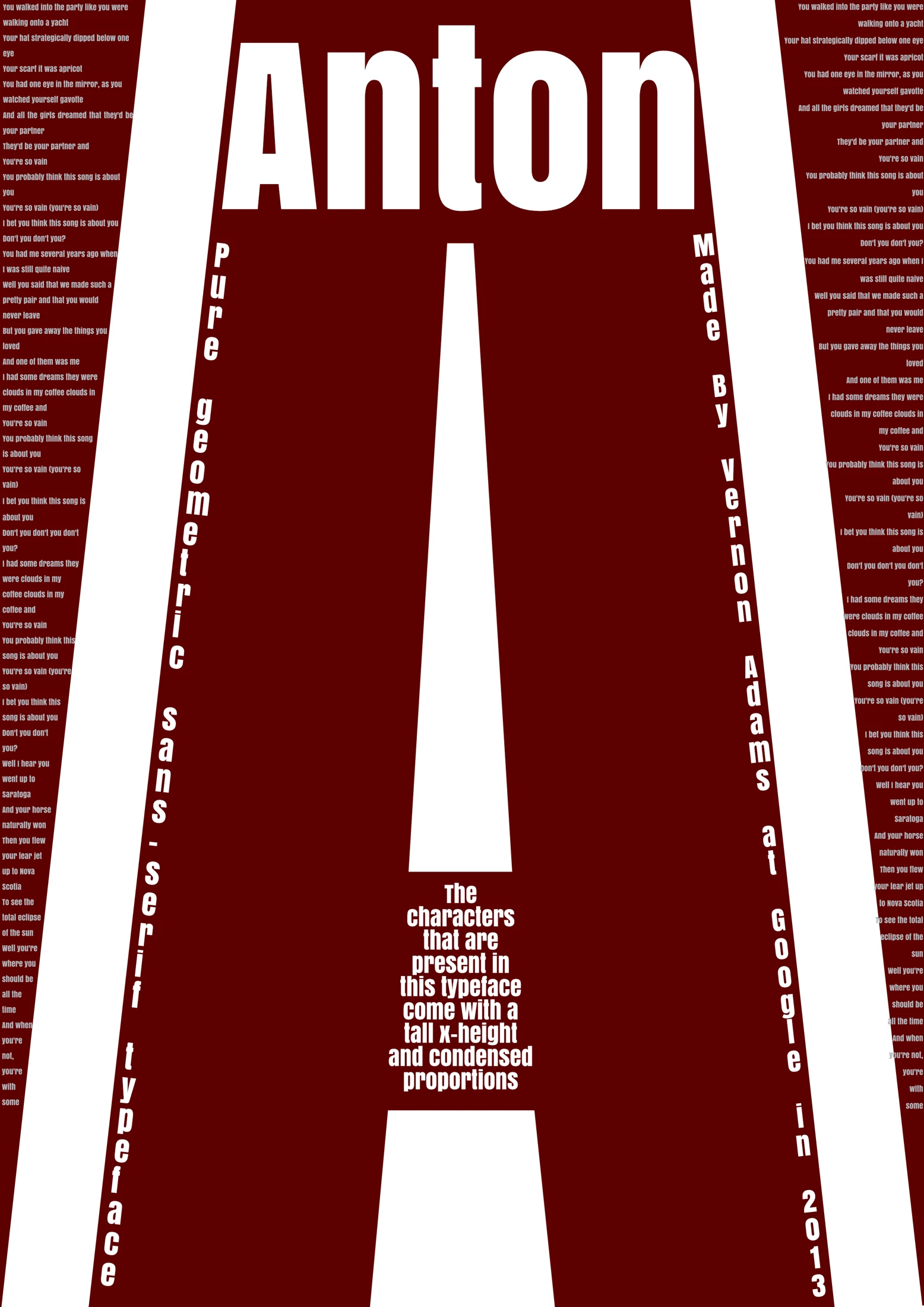
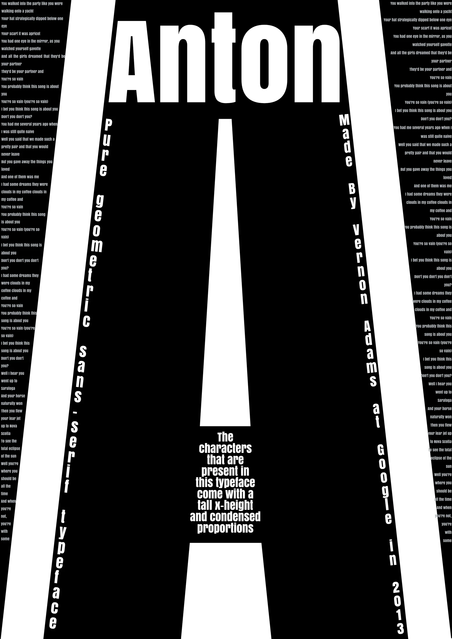
Two specimen-poster variations make one oversized letter carry a page.
Design archive
Retained in Anton’s portfolio; no separate collaborator breakdown accompanies these files.
Design study; publication status is not recorded.
Assignment & brand
Explore type as both content and composition.
Insight & approach
A formal visual study. No audience research or measured campaign result is claimed.
Concept & execution
A large letter A anchors a narrow poster; smaller words and specimen details are arranged around its contours. The black and red versions are retained as variations of one work.
Development / The thinking in motion
Two retained versions compare the same exaggerated letterform composition in black and white and in dark red and white.
The condensed central A, narrow side columns and stacked typography stay in place while the field colour changes. This makes colour the clearest variable across the pair.
Retained in Anton’s portfolio; no separate collaborator breakdown accompanies these files. The pair is presented as alternatives, without an invented selection order or a claim to designing the underlying Anton typeface.
Select an image to see it in full